Showing posts with label Jupyter. Show all posts

Wednesday, August 05, 2020

JupyterLabとipycanvasで図形に影をつける

ipycanvasで図形に影をつける事ができます。影をつけるには、以下の属性でパラメータを設定します。
shadow_color : 影の色
shadow_offset_x : 影の水平方向オフセット
shadow_offset_y : 影の垂直方向オフセット
shadow_blur = ぼかしの大きさ

サンプルコード

以下のサンプルコードは、円の図形と影を描画しています。
from ipycanvas import Canvas
from math import pi

canvas = Canvas(width=200, height=100)

canvas.shadow_color = '#c0c0c0'
canvas.shadow_offset_x = 5
canvas.shadow_offset_y = 5
canvas.shadow_blur = 5

canvas.fill_style = '#ccddff'
canvas.fill_arc(100, 50, 40, 0, 2 * pi)

canvas

〇サンプルコードの実行結果

関連情報

・ipycanvasのインストールは、以下を参照してください。
JupyterLabにipycanvasをインストールして、ノートブックにcanvasを利用して図形を描画する

Wednesday, July 29, 2020

JupyterLabとipycanvasでテキストのアライメントを設定する

ipycanvasでcanvasを使用して様々な図形を描画する事ができます。
テキストのアライメントを設定するには、text_align属性を使用します。
'start', 'end', 'left, 'right', 'center'が指定できます。

サンプルコード

以下のサンプルコードでは、アライメントを右寄せに設定して文字列を描画しています。
from ipycanvas import Canvas

canvas = Canvas(width=200, height=100)

canvas.fill_style = '#F25E5E'

canvas.font = '32px sanserif'
canvas.text_align = 'right'
canvas.fill_text("テストです", 200, 70)

canvas.stroke_rect(0, 0, 200, 100)
canvas

〇サンプルコードの実行結果

関連情報

・ipycanvasのインストールは、以下を参照してください。
JupyterLabにipycanvasをインストールして、ノートブックにcanvasを利用して図形を描画する

Tuesday, July 28, 2020

JupyterLabとipycanvasでテキストを描画する

ipycanvasでcanvasを使用して様々な図形を描画する事ができます。
テキストを描画する場合は、以下のメソッドを使用します。

・ stroke_text(text, x, y, max_width=None)
指定した文字列textをx, yの座標(テキスト左下位置)に中抜き描画します。max_widthを指定すると超えた場合、指定した幅に圧縮されます。

・ fill_text(text, x, y, max_width=None)
指定した文字列textをx, yの座標(テキスト左下位置)に塗りつぶし描画します。max_widthを指定すると超えた場合、指定した幅に圧縮されます。

font属性でフォントの大きさと種類を指定できます。デフォルトは'12px serif'です。

サンプルコード

以下のサンプルコードで文字列を描画します。
from ipycanvas import Canvas

canvas = Canvas(width=200, height=100)

canvas.stroke_style = '#7799dd'
canvas.fill_style = '#F25E5E'

canvas.font = '32px sanserif'
canvas.stroke_text("テストです", 10, 50)
canvas.fill_text("テストです", 10, 90)

canvas

〇サンプルコードの実行結果

関連情報

・ipycanvasのインストールは、以下を参照してください。
JupyterLabにipycanvasをインストールして、ノートブックにcanvasを利用して図形を描画する

Sunday, July 26, 2020

JupyterLabとipycanvasで二次曲線を描画する

ipycanvasでcanvasを使用して様々な図形を描画する事ができます。
二次曲線を描画する場合は、以下のメソッドを使用します。

・begin_path()
パスの作成を開始します。

・move_to(x, y)
ペンを指定座標に移動します。

・quadratic_curve_to(cp1x, cp1y, x, y)
二次曲線はパスでの最後の位置から新たな座標(最後の2つの引数x, y)まで、制御点を使って描画します。

・stroke()
パスの設定で線を描画します

サンプルコード

以下のサンプルコードで二次曲線を描画します。
from ipycanvas import Canvas

canvas = Canvas(width=200, height=100)

canvas.stroke_style = '#7799dd'

canvas.begin_path()
canvas.move_to(10,50)

# 二次曲線
# 制御点
cp1x = 100
cp1y = 5
canvas.quadratic_curve_to(cp1x,cp1y, 190,50)

canvas.stroke()
canvas

〇サンプルコードの実行結果

関連情報

・ipycanvasのインストールは、以下を参照してください。
JupyterLabにipycanvasをインストールして、ノートブックにcanvasを利用して図形を描画する

JupyterLabとipycanvasでベジェ曲線を描画する

ipycanvasでcanvasを使用して様々な図形を描画する事ができます。
ベジェ曲線を描画する場合は、以下のメソッドを使用します。

・begin_path()
パスの作成を開始します。

・move_to(x, y)
ペンを指定座標に移動します。

・bezier_curve_to(cp1x, cp1y, cp2x, cp2y, x, y)
ベジェ曲線はパスでの最後の位置から新たな座標(最後の2つの引数x, y)まで、2つの制御点を使って描画します。

・stroke()
パスの設定で線を描画します

サンプルコード

以下のサンプルコードでベジェ曲線を描画します。
from ipycanvas import Canvas

canvas = Canvas(width=200, height=100)

canvas.stroke_style = '#7799dd'

canvas.begin_path()
canvas.move_to(10,50)

# ベジェ曲線
# 制御点1
cp1x = 50
cp1y = 25
# 制御点2
cp2x = 150
cp2y = 90
canvas.bezier_curve_to(cp1x,cp1y, cp2x,cp2y, 190,50)

canvas.stroke()
canvas

〇サンプルコードの実行結果

関連情報

・ipycanvasのインストールは、以下を参照してください。
JupyterLabにipycanvasをインストールして、ノートブックにcanvasを利用して図形を描画する

Friday, July 24, 2020

JupyterLabとipycanvasでポリゴンを描画する

ipycanvasでcanvasを使用して様々な図形を描画する事ができます。
ポリゴンを描画する場合は、以下のメソッドを使用します。

・begin_path()
パスの作成を開始します。

・move_to(x, y)
ペンを指定座標に移動します。

・line_to(x, y)
現在の位置から指定座標に線を引きます。

・ fill(rule='nonzero')
現在のパスの設定で塗りつぶします。

サンプルコード

以下のサンプルコードでポリゴンを描画します。
from ipycanvas import Canvas

canvas = Canvas(width=200, height=100)

canvas.fill_style = '#7799dd'

canvas.begin_path()
canvas.move_to(100,10)
canvas.line_to(20,90)
canvas.line_to(180,70)
canvas.fill()

canvas

〇サンプルコードの実行結果

関連情報

・ipycanvasのインストールは、以下を参照してください。
JupyterLabにipycanvasをインストールして、ノートブックにcanvasを利用して図形を描画する

JupyterLabとipycanvasで直線を描画する

ipycanvasでcanvasを使用して様々な図形を描画する事ができます。
直線を描画する場合は、以下のメソッドを使用します。

・begin_path()
パスの作成を開始します。

・move_to(x, y)
ペンを指定座標に移動します。

・line_to(x, y)
現在の位置から指定座標に線を引きます。

・stroke()
パスの設定で線を描画します

〇サンプルコード
以下のサンプルコードで直線を描画します。
from ipycanvas import Canvas

canvas = Canvas(width=200, height=100)

canvas.stroke_style = '#7799dd'

canvas.begin_path()
canvas.move_to(0,100)
canvas.line_to(200,0)
canvas.stroke()

canvas
〇サンプルコードの実行結果

関連情報

・ipycanvasのインストールは、以下を参照してください。
JupyterLabにipycanvasをインストールして、ノートブックにcanvasを利用して図形を描画する

JupyterLabとipycanvasで円・円弧を描画する

ipycanvasでcanvasを使用して様々な図形を描画する事ができます。
円・円弧を描画する場合は、以下のメソッドを使用します。

・fill_arc(x, y, radius, start_angle, end_angle, anticlockwise=False)
塗りつぶした円・円弧を描画します。

・stroke_arc(x, y, radius, start_angle, end_angle, anticlockwise=False)
円・円弧を線で描画します。

サンプルコード

以下のサンプルコードで円・円弧を描画します。
from ipycanvas import Canvas
from math import pi

canvas = Canvas(width=200, height=100)

canvas.fill_style = 'darkblue'
canvas.stroke_style = '#7799dd'

canvas.fill_arc(50, 50, 40, pi*60/180, pi*240/180, anticlockwise=True)
canvas.stroke_arc(150, 50, 40, 0, 2 * pi)

canvas

〇サンプルコードの実行結果

関連情報

・ipycanvasのインストールは、以下を参照してください。 JupyterLabにipycanvasをインストールして、ノートブックにcanvasを利用して図形を描画する

JupyterLabとipycanvasで四角形を描画する

ipycanvasでcanvasを使用して様々な図形を描画する事ができます。
四角形を描画する場合は、以下のメソッドを使用します。

・fill_rect(x, y, width, height=None)
塗りつぶした四角形を描画します。

・stroke_rect(x, y, width, height=None)
四角形を線で描画します。

サンプルコード

以下のサンプルコードで四角形を描画します。
from ipycanvas import Canvas

canvas = Canvas(width=200, height=100)

canvas.fill_style = '#335588'
canvas.stroke_style = 'green'

canvas.fill_rect(10, 10, 80, 80)
canvas.stroke_rect(100, 10, 80, 80)

canvas

〇サンプルコードの実行結果

関連情報

・ipycanvasのインストールは、以下を参照してください。
JupyterLabにipycanvasをインストールして、ノートブックにcanvasを利用して図形を描画する

Saturday, March 23, 2019

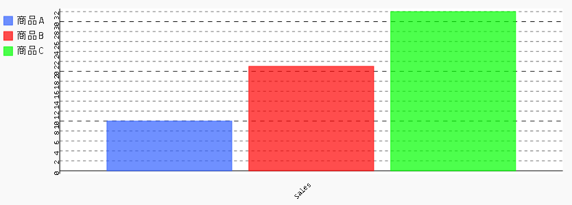
JupyterとPygalで軸ラベルを回転させる

軸ラベルを回転させるには、以下のサンプルのようにx_label_rotation, y_label_rotationを使用します。

〇サンプルコード
%matplotlib inline
import pandas as pd
import pygal as pg
from pygal.style import Style
style1 = Style(
  colors=('#3060ff', '#ff0000', '#00ff00')
)
chart = pg.Bar(x_label_rotation=-45, y_label_rotation=270, height=300, style=style1)
df = pd.DataFrame({'商品A': [10], '商品B':[21], '商品C':[32]})
chart.x_labels = ['Sales']
chart.add('商品A', df['商品A'])
chart.add('商品B', df['商品B'])
chart.add('商品C', df['商品C'])
display({'image/svg+xml': chart.render(is_unicode=True)}, raw=True)

〇出力画像


〇関連項目
VagrantでJupyter Lab、Pygalをインストールした仮想マシン(Ubuntu18.04)を構築する
http://serverarekore.blogspot.com/2019/03/vagrantjupyter-labpygalubuntu1804.html

VagrantでJupyter Lab、Pygalをインストールした仮想マシン(Debian Stretch/9.6)を構>築する
http://serverarekore.blogspot.com/2019/03/vagrantjupyter-labpygaldebian-stretch96.html

JupyterとPygalで半メーターグラフを表示する

半メーターグラフを表示するには、以下のサンプルのようにSolidGaugeとhalf_pieを使用します。

〇サンプルコード
%matplotlib inline
import pandas as pd
import pygal as pg
from pygal.style import Style
style1 = Style(
  colors=('#3060ff', '#ff0000', '#00ff00')
)
chart = pg.SolidGauge(half_pie=True, inner_radius=0.7, height=300, style=style1)
df = pd.DataFrame({'商品A':[55.2], '商品B':[30.4], '商品C':[15.0]})
chart.x_labels = ['percent']
chart.add('商品A', df['商品A'])
chart.add('商品B', df['商品B'])
chart.add('商品C', df['商品C'])
display({'image/svg+xml': chart.render(is_unicode=True)}, raw=True)

〇出力画像


〇関連項目
VagrantでJupyter Lab、Pygalをインストールした仮想マシン(Ubuntu18.04)を構築する
http://serverarekore.blogspot.com/2019/03/vagrantjupyter-labpygalubuntu1804.html

VagrantでJupyter Lab、Pygalをインストールした仮想マシン(Debian Stretch/9.6)を構>築する
http://serverarekore.blogspot.com/2019/03/vagrantjupyter-labpygaldebian-stretch96.html

JupyterとPygalでメーターグラフを表示する

メーターグラフを表示するには、以下のサンプルのようにSolidGaugeを使用します。

〇サンプルコード
%matplotlib inline
import pandas as pd
import pygal as pg
from pygal.style import Style
style1 = Style(
  colors=('#3060ff', '#ff0000', '#00ff00')
)
chart = pg.SolidGauge(inner_radius=0.7, height=300, style=style1)
df = pd.DataFrame({'商品A':[55.2], '商品B':[30.4], '商品C':[15.0]})
chart.x_labels = ['percent']
chart.add('商品A', df['商品A'])
chart.add('商品B', df['商品B'])
chart.add('商品C', df['商品C'])
display({'image/svg+xml': chart.render(is_unicode=True)}, raw=True)

〇出力画像


〇関連項目
VagrantでJupyter Lab、Pygalをインストールした仮想マシン(Ubuntu18.04)を構築する
http://serverarekore.blogspot.com/2019/03/vagrantjupyter-labpygalubuntu1804.html

VagrantでJupyter Lab、Pygalをインストールした仮想マシン(Debian Stretch/9.6)を構>築する
http://serverarekore.blogspot.com/2019/03/vagrantjupyter-labpygaldebian-stretch96.html

Friday, March 22, 2019

JupyterとPygalで半円グラフを表示する

半円グラフを表示するには、以下のサンプルのようにhalf_pieを使用します。

〇サンプルコード
%matplotlib inline
import pandas as pd
import pygal as pg
from pygal.style import Style
style1 = Style(
  colors=('#3060ff', '#ff0000', '#00ff00')
)
chart = pg.Pie(half_pie=True, height=300, style=style1)
df = pd.DataFrame({'商品A':[55], '商品B':[30], '商品C':[15]})
chart.x_labels = ['percent']
chart.add('商品A', df['商品A'])
chart.add('商品B', df['商品B'])
chart.add('商品C', df['商品C'])
display({'image/svg+xml': chart.render(is_unicode=True)}, raw=True)

〇出力画像


〇関連項目
VagrantでJupyter Lab、Pygalをインストールした仮想マシン(Ubuntu18.04)を構築する
http://serverarekore.blogspot.com/2019/03/vagrantjupyter-labpygalubuntu1804.html

VagrantでJupyter Lab、Pygalをインストールした仮想マシン(Debian Stretch/9.6)を構>築する
http://serverarekore.blogspot.com/2019/03/vagrantjupyter-labpygaldebian-stretch96.html

JupyterとPygalで半ドーナツグラフを表示する

半ドーナツグラフを表示するには、以下のサンプルのようにhalf_pieとinner_radiusを使用します。

〇サンプルコード
%matplotlib inline
import pandas as pd
import pygal as pg
from pygal.style import Style
style1 = Style(
  colors=('#3060ff', '#ff0000', '#00ff00')
)
chart = pg.Pie(half_pie=True,inner_radius=0.6, height=300, style=style1)
df = pd.DataFrame({'商品A':[55], '商品B':[30], '商品C':[15]})
chart.x_labels = ['percent']
chart.add('商品A', df['商品A'])
chart.add('商品B', df['商品B'])
chart.add('商品C', df['商品C'])
display({'image/svg+xml': chart.render(is_unicode=True)}, raw=True)

〇出力画像


〇関連項目
VagrantでJupyter Lab、Pygalをインストールした仮想マシン(Ubuntu18.04)を構築する
http://serverarekore.blogspot.com/2019/03/vagrantjupyter-labpygalubuntu1804.html

VagrantでJupyter Lab、Pygalをインストールした仮想マシン(Debian Stretch/9.6)を構>築する
http://serverarekore.blogspot.com/2019/03/vagrantjupyter-labpygaldebian-stretch96.html

JupyterとPygalでドーナツグラフを表示する

ドーナツグラフを表示するには、以下のサンプルのようにPieとinner_radiusを使用します。

〇サンプルコード
%matplotlib inline
import pandas as pd
import pygal as pg
from pygal.style import Style
style1 = Style(
  colors=('#3060ff', '#ff0000', '#00ff00')
)
chart = pg.Pie(inner_radius=0.6, height=300, style=style1)
df = pd.DataFrame({'商品A':[55], '商品B':[30], '商品C':[15]})
chart.x_labels = ['percent']
chart.add('商品A', df['商品A'])
chart.add('商品B', df['商品B'])
chart.add('商品C', df['商品C'])
display({'image/svg+xml': chart.render(is_unicode=True)}, raw=True)

〇出力画像


〇関連項目
VagrantでJupyter Lab、Pygalをインストールした仮想マシン(Ubuntu18.04)を構築する
http://serverarekore.blogspot.com/2019/03/vagrantjupyter-labpygalubuntu1804.html

VagrantでJupyter Lab、Pygalをインストールした仮想マシン(Debian Stretch/9.6)を構>築する
http://serverarekore.blogspot.com/2019/03/vagrantjupyter-labpygaldebian-stretch96.html

JupyterとPygalで円グラフを表示する

円グラフを表示するには、以下のサンプルのようにPieを使用します。

〇サンプルコード
%matplotlib inline
import pandas as pd
import pygal as pg
from pygal.style import Style
style1 = Style(
  colors=('#3060ff', '#ff0000', '#00ff00')
)
chart = pg.Pie(height=300, style=style1)
df = pd.DataFrame({'商品A':[55], '商品B':[30], '商品C':[15]})
chart.x_labels = ['percent']
chart.add('商品A', df['商品A'])
chart.add('商品B', df['商品B'])
chart.add('商品C', df['商品C'])
display({'image/svg+xml': chart.render(is_unicode=True)}, raw=True)

〇出力画像


〇関連項目
VagrantでJupyter Lab、Pygalをインストールした仮想マシン(Ubuntu18.04)を構築する
http://serverarekore.blogspot.com/2019/03/vagrantjupyter-labpygalubuntu1804.html

VagrantでJupyter Lab、Pygalをインストールした仮想マシン(Debian Stretch/9.6)を構>築する
http://serverarekore.blogspot.com/2019/03/vagrantjupyter-labpygaldebian-stretch96.html

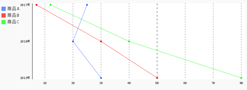
JupyterとPygalで縦方向の折れ線グラフを表示する

縦方向の折れ線グラフを表示するには、以下のサンプルのようにHorizontalLineを使用します。

〇サンプルコード
%matplotlib inline
import pandas as pd
import pygal as pg
from pygal.style import Style
style1 = Style(
  colors=('#3060ff', '#ff0000', '#00ff00')
)
chart = pg.HorizontalLine(height=300, style=style1)
df = pd.DataFrame({'商品A': [25, 20, 30], '商品B':[7, 30, 50], '商品C':[12, 40, 80]})
chart.x_labels = ['2017年', '2018年', '2019年']
chart.add('商品A', df['商品A'])
chart.add('商品B', df['商品B'])
chart.add('商品C', df['商品C'])
display({'image/svg+xml': chart.render(is_unicode=True)}, raw=True)

〇出力画像


〇関連項目
VagrantでJupyter Lab、Pygalをインストールした仮想マシン(Ubuntu18.04)を構築する
http://serverarekore.blogspot.com/2019/03/vagrantjupyter-labpygalubuntu1804.html

VagrantでJupyter Lab、Pygalをインストールした仮想マシン(Debian Stretch/9.6)を構>築する
http://serverarekore.blogspot.com/2019/03/vagrantjupyter-labpygaldebian-stretch96.html

JupyterとPygalで積み上げ折れ線グラフを表示する

積み上げ折れ線グラフを表示するには、以下のサンプルのようにStackedLineを使用します。

〇サンプルコード
%matplotlib inline
import pandas as pd
import pygal as pg
from pygal.style import Style
style1 = Style(
  colors=('#3060ff', '#ff0000', '#00ff00')
)
chart = pg.StackedLine(height=300, style=style1, fill=True)
df = pd.DataFrame({'商品A': [25, 20, 30], '商品B':[7, 30, 50], '商品C':[12, 40, 80]})
chart.x_labels = ['2017年', '2018年', '2019年']
chart.add('商品A', df['商品A'])
chart.add('商品B', df['商品B'])
chart.add('商品C', df['商品C'])
display({'image/svg+xml': chart.render(is_unicode=True)}, raw=True)

〇出力画像


〇関連項目
VagrantでJupyter Lab、Pygalをインストールした仮想マシン(Ubuntu18.04)を構築する
http://serverarekore.blogspot.com/2019/03/vagrantjupyter-labpygalubuntu1804.html

VagrantでJupyter Lab、Pygalをインストールした仮想マシン(Debian Stretch/9.6)を構>築する
http://serverarekore.blogspot.com/2019/03/vagrantjupyter-labpygaldebian-stretch96.html

Thursday, March 21, 2019

JupyterとPygalで折れ線領域グラフを表示する

折れ線領域グラフを表示するには、以下のサンプルのようにfillを使用します。

〇サンプルコード
%matplotlib inline
import pandas as pd
import pygal as pg
from pygal.style import Style
style1 = Style(
  colors=('#3060ff', '#ff0000', '#00ff00')
  ,opacity=0.3
)
chart = pg.Line(height=300, style=style1, fill=True)
df = pd.DataFrame({'商品A': [25, 20, 30], '商品B':[7, 30, 50], '商品C':[12, 40, 80]})
chart.x_labels = ['2017年', '2018年', '2019年']
chart.add('商品A', df['商品A'])
chart.add('商品B', df['商品B'])
chart.add('商品C', df['商品C'])
display({'image/svg+xml': chart.render(is_unicode=True)}, raw=True)

○出力画像


〇関連項目
VagrantでJupyter Lab、Pygalをインストールした仮想マシン(Ubuntu18.04)を構築する
http://serverarekore.blogspot.com/2019/03/vagrantjupyter-labpygalubuntu1804.html

VagrantでJupyter Lab、Pygalをインストールした仮想マシン(Debian Stretch/9.6)を構築する
http://serverarekore.blogspot.com/2019/03/vagrantjupyter-labpygaldebian-stretch96.html

JupyterとPygalで折れ線グラフのY軸目盛り線を非表示にする

折れ線グラフのY軸目盛り線を非表示にするには、以下のサンプルのようにshow_y_guidesを使用します。

〇サンプルコード
%matplotlib inline
import pandas as pd
import pygal as pg
from pygal.style import Style
style1 = Style(
  colors=('#3060ff', '#ff0000', '#00ff00')
)
chart = pg.Line(height=300, style=style1, show_y_guides=False)
df = pd.DataFrame({'商品A': [25, 20, 30], '商品B':[7, 30, 50], '商品C':[12, 40, 80]})
chart.x_labels = ['2017年', '2018年', '2019年']
chart.add('商品A', df['商品A'])
chart.add('商品B', df['商品B'])
chart.add('商品C', df['商品C'])
display({'image/svg+xml': chart.render(is_unicode=True)}, raw=True)

○出力画像


〇関連項目
VagrantでJupyter Lab、Pygalをインストールした仮想マシン(Ubuntu18.04)を構築する
http://serverarekore.blogspot.com/2019/03/vagrantjupyter-labpygalubuntu1804.html

VagrantでJupyter Lab、Pygalをインストールした仮想マシン(Debian Stretch/9.6)を構築する
http://serverarekore.blogspot.com/2019/03/vagrantjupyter-labpygaldebian-stretch96.html