Friday, March 22, 2019

JupyterとPygalでドーナツグラフを表示する

ドーナツグラフを表示するには、以下のサンプルのようにPieとinner_radiusを使用します。

〇サンプルコード
%matplotlib inline
import pandas as pd
import pygal as pg
from pygal.style import Style
style1 = Style(
  colors=('#3060ff', '#ff0000', '#00ff00')
)
chart = pg.Pie(inner_radius=0.6, height=300, style=style1)
df = pd.DataFrame({'商品A':[55], '商品B':[30], '商品C':[15]})
chart.x_labels = ['percent']
chart.add('商品A', df['商品A'])
chart.add('商品B', df['商品B'])
chart.add('商品C', df['商品C'])
display({'image/svg+xml': chart.render(is_unicode=True)}, raw=True)

〇出力画像


〇関連項目
VagrantでJupyter Lab、Pygalをインストールした仮想マシン(Ubuntu18.04)を構築する
http://serverarekore.blogspot.com/2019/03/vagrantjupyter-labpygalubuntu1804.html

VagrantでJupyter Lab、Pygalをインストールした仮想マシン(Debian Stretch/9.6)を構>築する
http://serverarekore.blogspot.com/2019/03/vagrantjupyter-labpygaldebian-stretch96.html

JupyterとPygalで円グラフを表示する

円グラフを表示するには、以下のサンプルのようにPieを使用します。

〇サンプルコード
%matplotlib inline
import pandas as pd
import pygal as pg
from pygal.style import Style
style1 = Style(
  colors=('#3060ff', '#ff0000', '#00ff00')
)
chart = pg.Pie(height=300, style=style1)
df = pd.DataFrame({'商品A':[55], '商品B':[30], '商品C':[15]})
chart.x_labels = ['percent']
chart.add('商品A', df['商品A'])
chart.add('商品B', df['商品B'])
chart.add('商品C', df['商品C'])
display({'image/svg+xml': chart.render(is_unicode=True)}, raw=True)

〇出力画像


〇関連項目
VagrantでJupyter Lab、Pygalをインストールした仮想マシン(Ubuntu18.04)を構築する
http://serverarekore.blogspot.com/2019/03/vagrantjupyter-labpygalubuntu1804.html

VagrantでJupyter Lab、Pygalをインストールした仮想マシン(Debian Stretch/9.6)を構>築する
http://serverarekore.blogspot.com/2019/03/vagrantjupyter-labpygaldebian-stretch96.html
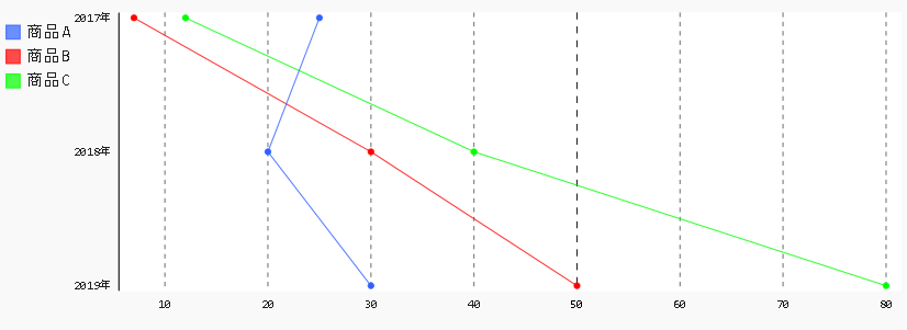
JupyterとPygalで縦方向の折れ線グラフを表示する

縦方向の折れ線グラフを表示するには、以下のサンプルのようにHorizontalLineを使用します。

〇サンプルコード
%matplotlib inline
import pandas as pd
import pygal as pg
from pygal.style import Style
style1 = Style(
  colors=('#3060ff', '#ff0000', '#00ff00')
)
chart = pg.HorizontalLine(height=300, style=style1)
df = pd.DataFrame({'商品A': [25, 20, 30], '商品B':[7, 30, 50], '商品C':[12, 40, 80]})
chart.x_labels = ['2017年', '2018年', '2019年']
chart.add('商品A', df['商品A'])
chart.add('商品B', df['商品B'])
chart.add('商品C', df['商品C'])
display({'image/svg+xml': chart.render(is_unicode=True)}, raw=True)

〇出力画像


〇関連項目
VagrantでJupyter Lab、Pygalをインストールした仮想マシン(Ubuntu18.04)を構築する
http://serverarekore.blogspot.com/2019/03/vagrantjupyter-labpygalubuntu1804.html

VagrantでJupyter Lab、Pygalをインストールした仮想マシン(Debian Stretch/9.6)を構>築する
http://serverarekore.blogspot.com/2019/03/vagrantjupyter-labpygaldebian-stretch96.html

JupyterとPygalで積み上げ折れ線グラフを表示する

積み上げ折れ線グラフを表示するには、以下のサンプルのようにStackedLineを使用します。

〇サンプルコード
%matplotlib inline
import pandas as pd
import pygal as pg
from pygal.style import Style
style1 = Style(
  colors=('#3060ff', '#ff0000', '#00ff00')
)
chart = pg.StackedLine(height=300, style=style1, fill=True)
df = pd.DataFrame({'商品A': [25, 20, 30], '商品B':[7, 30, 50], '商品C':[12, 40, 80]})
chart.x_labels = ['2017年', '2018年', '2019年']
chart.add('商品A', df['商品A'])
chart.add('商品B', df['商品B'])
chart.add('商品C', df['商品C'])
display({'image/svg+xml': chart.render(is_unicode=True)}, raw=True)

〇出力画像


〇関連項目
VagrantでJupyter Lab、Pygalをインストールした仮想マシン(Ubuntu18.04)を構築する
http://serverarekore.blogspot.com/2019/03/vagrantjupyter-labpygalubuntu1804.html

VagrantでJupyter Lab、Pygalをインストールした仮想マシン(Debian Stretch/9.6)を構>築する
http://serverarekore.blogspot.com/2019/03/vagrantjupyter-labpygaldebian-stretch96.html

Thursday, March 21, 2019

JupyterとPygalで折れ線領域グラフを表示する

折れ線領域グラフを表示するには、以下のサンプルのようにfillを使用します。

〇サンプルコード
%matplotlib inline
import pandas as pd
import pygal as pg
from pygal.style import Style
style1 = Style(
  colors=('#3060ff', '#ff0000', '#00ff00')
  ,opacity=0.3
)
chart = pg.Line(height=300, style=style1, fill=True)
df = pd.DataFrame({'商品A': [25, 20, 30], '商品B':[7, 30, 50], '商品C':[12, 40, 80]})
chart.x_labels = ['2017年', '2018年', '2019年']
chart.add('商品A', df['商品A'])
chart.add('商品B', df['商品B'])
chart.add('商品C', df['商品C'])
display({'image/svg+xml': chart.render(is_unicode=True)}, raw=True)

○出力画像


〇関連項目
VagrantでJupyter Lab、Pygalをインストールした仮想マシン(Ubuntu18.04)を構築する
http://serverarekore.blogspot.com/2019/03/vagrantjupyter-labpygalubuntu1804.html

VagrantでJupyter Lab、Pygalをインストールした仮想マシン(Debian Stretch/9.6)を構築する
http://serverarekore.blogspot.com/2019/03/vagrantjupyter-labpygaldebian-stretch96.html

JupyterとPygalで折れ線グラフのY軸目盛り線を非表示にする

折れ線グラフのY軸目盛り線を非表示にするには、以下のサンプルのようにshow_y_guidesを使用します。

〇サンプルコード
%matplotlib inline
import pandas as pd
import pygal as pg
from pygal.style import Style
style1 = Style(
  colors=('#3060ff', '#ff0000', '#00ff00')
)
chart = pg.Line(height=300, style=style1, show_y_guides=False)
df = pd.DataFrame({'商品A': [25, 20, 30], '商品B':[7, 30, 50], '商品C':[12, 40, 80]})
chart.x_labels = ['2017年', '2018年', '2019年']
chart.add('商品A', df['商品A'])
chart.add('商品B', df['商品B'])
chart.add('商品C', df['商品C'])
display({'image/svg+xml': chart.render(is_unicode=True)}, raw=True)

○出力画像


〇関連項目
VagrantでJupyter Lab、Pygalをインストールした仮想マシン(Ubuntu18.04)を構築する
http://serverarekore.blogspot.com/2019/03/vagrantjupyter-labpygalubuntu1804.html

VagrantでJupyter Lab、Pygalをインストールした仮想マシン(Debian Stretch/9.6)を構築する
http://serverarekore.blogspot.com/2019/03/vagrantjupyter-labpygaldebian-stretch96.html

JupyterとPygalで折れ線グラフのX軸目盛線を表示する

折れ線グラフのX軸目盛線を表示するには、以下のサンプルのようにshow_x_guidesを使用します。

〇サンプルコード
%matplotlib inline
import pandas as pd
import pygal as pg
from pygal.style import Style
style1 = Style(
  colors=('#3060ff', '#ff0000', '#00ff00')
)
chart = pg.Line(height=300, style=style1, show_x_guides=True)
df = pd.DataFrame({'商品A': [25, 20, 30], '商品B':[7, 30, 50], '商品C':[12, 40, 80]})
chart.x_labels = ['2017年', '2018年', '2019年']
chart.add('商品A', df['商品A'])
chart.add('商品B', df['商品B'])
chart.add('商品C', df['商品C'])
display({'image/svg+xml': chart.render(is_unicode=True)}, raw=True)

○出力画像


〇関連項目
VagrantでJupyter Lab、Pygalをインストールした仮想マシン(Ubuntu18.04)を構築する
http://serverarekore.blogspot.com/2019/03/vagrantjupyter-labpygalubuntu1804.html

VagrantでJupyter Lab、Pygalをインストールした仮想マシン(Debian Stretch/9.6)を構築する
http://serverarekore.blogspot.com/2019/03/vagrantjupyter-labpygaldebian-stretch96.html
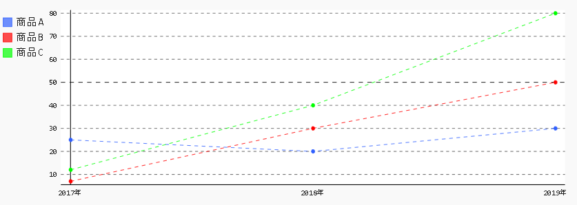
JupyterとPygalで折れ線グラフの線を点線にする

折れ線グラフの線を点線にするには、以下のサンプルのようにstroke_styleとdasharrayを使用します。

〇サンプルコード
%matplotlib inline
import pandas as pd
import pygal as pg
from pygal.style import Style
style1 = Style(
  colors=('#3060ff', '#ff0000', '#00ff00')
)
chart = pg.Line(height=300, style=style1, stroke_style={'dasharray':'5,5'})
df = pd.DataFrame({'商品A': [25, 20, 30], '商品B':[7, 30, 50], '商品C':[12, 40, 80]})
chart.x_labels = ['2017年', '2018年', '2019年']
chart.add('商品A', df['商品A'])
chart.add('商品B', df['商品B'])
chart.add('商品C', df['商品C'])
display({'image/svg+xml': chart.render(is_unicode=True)}, raw=True)

○出力画像


〇関連項目
VagrantでJupyter Lab、Pygalをインストールした仮想マシン(Ubuntu18.04)を構築する
http://serverarekore.blogspot.com/2019/03/vagrantjupyter-labpygalubuntu1804.html

VagrantでJupyter Lab、Pygalをインストールした仮想マシン(Debian Stretch/9.6)を構築する
http://serverarekore.blogspot.com/2019/03/vagrantjupyter-labpygaldebian-stretch96.html

JupyterとPygalで折れ線グラフの点を非表示にする

折れ線グラフの点を非表示にするには、以下のサンプルのようにshow_dotsを使用します。

〇サンプルコード
%matplotlib inline
import pandas as pd
import pygal as pg
from pygal.style import Style
style1 = Style(
  colors=('#3060ff', '#ff0000', '#00ff00')
)
chart = pg.Line(height=300, style=style1, show_dots=False)
df = pd.DataFrame({'商品A': [25, 20, 30], '商品B':[7, 30, 50], '商品C':[12, 40, 80]})
chart.x_labels = ['2017年', '2018年', '2019年']
chart.add('商品A', df['商品A'])
chart.add('商品B', df['商品B'])
chart.add('商品C', df['商品C'])
display({'image/svg+xml': chart.render(is_unicode=True)}, raw=True)

○出力画像


〇関連項目
VagrantでJupyter Lab、Pygalをインストールした仮想マシン(Ubuntu18.04)を構築する
http://serverarekore.blogspot.com/2019/03/vagrantjupyter-labpygalubuntu1804.html

VagrantでJupyter Lab、Pygalをインストールした仮想マシン(Debian Stretch/9.6)を構築する
http://serverarekore.blogspot.com/2019/03/vagrantjupyter-labpygaldebian-stretch96.html

JupyterとPygalで折れ線グラフの点の大きさを変更する

折れ線グラフの点の大きさを変更するには、以下のサンプルのようにdots_sizeを使用します。

〇サンプルコード
%matplotlib inline
import pandas as pd
import pygal as pg
from pygal.style import Style
style1 = Style(
  colors=('#3060ff', '#ff0000', '#00ff00')
)
chart = pg.Line(height=300, style=style1, dots_size=10)
df = pd.DataFrame({'商品A': [25, 20, 30], '商品B':[7, 30, 50], '商品C':[12, 40, 80]})
chart.x_labels = ['2017年', '2018年', '2019年']
chart.add('商品A', df['商品A'])
chart.add('商品B', df['商品B'])
chart.add('商品C', df['商品C'])
display({'image/svg+xml': chart.render(is_unicode=True)}, raw=True)

○出力画像


〇関連項目
VagrantでJupyter Lab、Pygalをインストールした仮想マシン(Ubuntu18.04)を構築する
http://serverarekore.blogspot.com/2019/03/vagrantjupyter-labpygalubuntu1804.html

VagrantでJupyter Lab、Pygalをインストールした仮想マシン(Debian Stretch/9.6)を構築する
http://serverarekore.blogspot.com/2019/03/vagrantjupyter-labpygaldebian-stretch96.html

JupyterとPygalで折れ線グラフの線の太さを変更する

折れ線グラフの線の太さを変更には、以下のサンプルのようにstroke_styleのwidthを使用します。

〇サンプルコード
%matplotlib inline
import pandas as pd
import pygal as pg
from pygal.style import Style
style1 = Style(
  colors=('#3060ff', '#ff0000', '#00ff00')
)
chart = pg.Line(height=300, style=style1, stroke_style={'width':10})
df = pd.DataFrame({'商品A': [25, 20, 30], '商品B':[7, 30, 50], '商品C':[12, 40, 80]})
chart.x_labels = ['2017年', '2018年', '2019年']
chart.add('商品A', df['商品A'])
chart.add('商品B', df['商品B'])
chart.add('商品C', df['商品C'])
display({'image/svg+xml': chart.render(is_unicode=True)}, raw=True)

○出力画像


〇関連項目
VagrantでJupyter Lab、Pygalをインストールした仮想マシン(Ubuntu18.04)を構築する
http://serverarekore.blogspot.com/2019/03/vagrantjupyter-labpygalubuntu1804.html

VagrantでJupyter Lab、Pygalをインストールした仮想マシン(Debian Stretch/9.6)を構築する
http://serverarekore.blogspot.com/2019/03/vagrantjupyter-labpygaldebian-stretch96.html

JupyterとPygalで折れ線グラフ表示する

折れ線グラフ表示するには、以下のサンプルのようにLineを使用します。

〇サンプルコード
%matplotlib inline
import pandas as pd
import pygal as pg
from pygal.style import Style
style1 = Style(
  colors=('#3060ff', '#ff0000', '#00ff00')
)
chart = pg.Line(height=300, style=style1)
df = pd.DataFrame({'商品A': [25, 20, 30], '商品B':[7, 30, 50], '商品C':[12, 40, 80]})
chart.x_labels = ['2017年', '2018年', '2019年']
chart.add('商品A', df['商品A'])
chart.add('商品B', df['商品B'])
chart.add('商品C', df['商品C'])
display({'image/svg+xml': chart.render(is_unicode=True)}, raw=True)

○出力画像


〇関連項目
VagrantでJupyter Lab、Pygalをインストールした仮想マシン(Ubuntu18.04)を構築する
http://serverarekore.blogspot.com/2019/03/vagrantjupyter-labpygalubuntu1804.html

VagrantでJupyter Lab、Pygalをインストールした仮想マシン(Debian Stretch/9.6)を構築する
http://serverarekore.blogspot.com/2019/03/vagrantjupyter-labpygaldebian-stretch96.html

JupyterとPygalで横方向のグラフを表示する

横方向のグラフを表示するには、以下のサンプルのようにHorizontalBarを使用します。

〇サンプルコード
%matplotlib inline
import pandas as pd
import pygal as pg
from pygal.style import Style
style1 = Style(
  colors=('#3060ff', '#ff0000', '#00ff00')
)
chart = pg.HorizontalBar(height=300, style=style1)
df = pd.DataFrame({'商品A': [10], '商品B':[21], '商品C':[32]})
chart.x_labels = ['Sales']
chart.add('商品A', df['商品A'])
chart.add('商品B', df['商品B'])
chart.add('商品C', df['商品C'])
display({'image/svg+xml': chart.render(is_unicode=True)}, raw=True)

○出力画像


〇関連項目
VagrantでJupyter Lab、Pygalをインストールした仮想マシン(Ubuntu18.04)を構築する
http://serverarekore.blogspot.com/2019/03/vagrantjupyter-labpygalubuntu1804.html

VagrantでJupyter Lab、Pygalをインストールした仮想マシン(Debian Stretch/9.6)を構築する
http://serverarekore.blogspot.com/2019/03/vagrantjupyter-labpygaldebian-stretch96.html

JupyterとPygalで積み上げ棒グラフ表示する

積み上げ棒グラフ表示するには、以下のサンプルのようにStackedBarを使用します。

〇サンプルコード
%matplotlib inline
import pandas as pd
import pygal as pg
from pygal.style import Style
style1 = Style(
  colors=('#3060ff', '#ff0000', '#00ff00')
)
chart = pg.StackedBar(legend_at_bottom=True, legend_at_bottom_columns=3, height=300, style=style1)
df = pd.DataFrame({'商品A': [10, 20, 30], '商品B':[30, 40, 50], '商品C':[60, 40, 20]})
chart.x_labels = ['2017年', '2018年', '2019年']
chart.add('商品A', df['商品A'])
chart.add('商品B', df['商品B'])
chart.add('商品C', df['商品C'])
display({'image/svg+xml': chart.render(is_unicode=True)}, raw=True)

○出力画像


〇関連項目
VagrantでJupyter Lab、Pygalをインストールした仮想マシン(Ubuntu18.04)を構築する
http://serverarekore.blogspot.com/2019/03/vagrantjupyter-labpygalubuntu1804.html

VagrantでJupyter Lab、Pygalをインストールした仮想マシン(Debian Stretch/9.6)を構築する
http://serverarekore.blogspot.com/2019/03/vagrantjupyter-labpygaldebian-stretch96.html

Sunday, March 17, 2019

JupyterとPygalでグラフ凡例を下に表示する

グラフ凡例を下に表示するには、以下のサンプルのようにlegend_at_bottomを使用します。

〇サンプルコード
%matplotlib inline
import pandas as pd
import pygal as pg
from pygal.style import Style
style1 = Style(
  colors=('#3060ff', '#ff0000', '#00ff00')
)
chart = pg.Bar(legend_at_bottom=True, legend_at_bottom_columns=3, height=300, style=style1)
df = pd.DataFrame({'商品A': [10], '商品B':[21], '商品C':[32]})
chart.x_labels = ['Sales']
chart.add('商品A', df['商品A'])
chart.add('商品B', df['商品B'])
chart.add('商品C', df['商品C'])
display({'image/svg+xml': chart.render(is_unicode=True)}, raw=True)

○出力画像


〇関連項目
VagrantでJupyter Lab、Pygalをインストールした仮想マシン(Ubuntu18.04)を構築する
http://serverarekore.blogspot.com/2019/03/vagrantjupyter-labpygalubuntu1804.html

VagrantでJupyter Lab、Pygalをインストールした仮想マシン(Debian Stretch/9.6)を構築する
http://serverarekore.blogspot.com/2019/03/vagrantjupyter-labpygaldebian-stretch96.html

JupyterとPygalでグラフ凡例を表示・非表示にする

グラフ凡例を表示・非表示にするには、以下のサンプルのようにshow_legendを使用します。

〇サンプルコード
%matplotlib inline
import pandas as pd
import pygal as pg
from pygal.style import Style
style1 = Style(
  colors=('#3060ff', '#ff0000', '#00ff00')
)
chart = pg.Bar(show_legend=False, height=300, style=style1)
df = pd.DataFrame({'商品A': [10], '商品B':[21], '商品C':[32]})
chart.x_labels = ['Sales']
chart.add('商品A', df['商品A'])
chart.add('商品B', df['商品B'])
chart.add('商品C', df['商品C'])
display({'image/svg+xml': chart.render(is_unicode=True)}, raw=True)

○出力画像


〇関連項目
VagrantでJupyter Lab、Pygalをインストールした仮想マシン(Ubuntu18.04)を構築する
http://serverarekore.blogspot.com/2019/03/vagrantjupyter-labpygalubuntu1804.html

VagrantでJupyter Lab、Pygalをインストールした仮想マシン(Debian Stretch/9.6)を構築する
http://serverarekore.blogspot.com/2019/03/vagrantjupyter-labpygaldebian-stretch96.html

Friday, March 15, 2019

JupyterとPygalで凡例のフォントサイズを指定する

凡例のフォントサイズを指定するには、以下のサンプルのようにlegend_font_sizeを使用します。

〇サンプルコード
%matplotlib inline
import pandas as pd
import pygal as pg
from pygal.style import Style
style1 = Style(
  legend_font_size=24,
  colors=('#3060ff', '#ff0000', '#00ff00')
)
chart = pg.Bar(height=300, style=style1)
df = pd.DataFrame({'商品A': [10], '商品B':[21], '商品C':[32]})
chart.x_labels = ['Sales']
chart.add('商品A', df['商品A'])
chart.add('商品B', df['商品B'])
chart.add('商品C', df['商品C'])
display({'image/svg+xml': chart.render(is_unicode=True)}, raw=True)

○出力画像


〇関連項目
VagrantでJupyter Lab、Pygalをインストールした仮想マシン(Ubuntu18.04)を構築する
http://serverarekore.blogspot.com/2019/03/vagrantjupyter-labpygalubuntu1804.html

VagrantでJupyter Lab、Pygalをインストールした仮想マシン(Debian Stretch/9.6)を構築する
http://serverarekore.blogspot.com/2019/03/vagrantjupyter-labpygaldebian-stretch96.html

JupyterとPygalでグラフの題名のフォントサイズを指定する

グラフの題名のフォントサイズを指定するには、以下のサンプルのようにtitle_font_sizeを使用します。

〇サンプルコード
%matplotlib inline
import pandas as pd
import pygal as pg
from pygal.style import Style
style1 = Style(
  title_font_size=40,
  colors=('#3060ff', '#ff0000', '#00ff00')
)
chart = pg.Bar(title='商品別売上', height=300, style=style1)
df = pd.DataFrame({'商品A': [10], '商品B':[21], '商品C':[32]})
chart.x_labels = ['Sales']
chart.add('商品A', df['商品A'])
chart.add('商品B', df['商品B'])
chart.add('商品C', df['商品C'])
display({'image/svg+xml': chart.render(is_unicode=True)}, raw=True)

○出力画像


〇関連項目
VagrantでJupyter Lab、Pygalをインストールした仮想マシン(Ubuntu18.04)を構築する
http://serverarekore.blogspot.com/2019/03/vagrantjupyter-labpygalubuntu1804.html

VagrantでJupyter Lab、Pygalをインストールした仮想マシン(Debian Stretch/9.6)を構築する
http://serverarekore.blogspot.com/2019/03/vagrantjupyter-labpygaldebian-stretch96.html

JupyterとPygalでグラフの数値の位置を指定する

グラフの数値の位置を指定するには、以下のサンプルのようにprint_values_positionを使用します。

〇サンプルコード
%matplotlib inline
import pandas as pd
import pygal as pg
from pygal.style import Style
style1 = Style(
  colors=('#3060ff', '#ff0000', '#00ff00')
)
chart = pg.Bar(print_values=True, print_values_position='top', height=300, style=style1)
df = pd.DataFrame({'商品A': [10], '商品B':[21], '商品C':[32]})
chart.x_labels = ['Sales']
chart.add('商品A', df['商品A'])
chart.add('商品B', df['商品B'])
chart.add('商品C', df['商品C'])
display({'image/svg+xml': chart.render(is_unicode=True)}, raw=True)

○出力画像


〇関連項目
VagrantでJupyter Lab、Pygalをインストールした仮想マシン(Ubuntu18.04)を構築する
http://serverarekore.blogspot.com/2019/03/vagrantjupyter-labpygalubuntu1804.html

VagrantでJupyter Lab、Pygalをインストールした仮想マシン(Debian Stretch/9.6)を構築する
http://serverarekore.blogspot.com/2019/03/vagrantjupyter-labpygaldebian-stretch96.html

JupyterとPygalでグラフの数値のフォントサイズを指定する

グラフの数値のフォントサイズを指定するには、以下のサンプルのようにvalue_font_sizeを使用します。

〇サンプルコード
%matplotlib inline
import pandas as pd
import pygal as pg
from pygal.style import Style
style1 = Style(
  value_font_size=50,
  colors=('#3060ff', '#ff0000', '#00ff00')
)
chart = pg.Bar(print_values=True, height=300, style=style1)
df = pd.DataFrame({'商品A': [10], '商品B':[21], '商品C':[32]})
chart.x_labels = ['Sales']
chart.add('商品A', df['商品A'])
chart.add('商品B', df['商品B'])
chart.add('商品C', df['商品C'])
display({'image/svg+xml': chart.render(is_unicode=True)}, raw=True)

○出力画像


〇関連項目
VagrantでJupyter Lab、Pygalをインストールした仮想マシン(Ubuntu18.04)を構築する
http://serverarekore.blogspot.com/2019/03/vagrantjupyter-labpygalubuntu1804.html

VagrantでJupyter Lab、Pygalをインストールした仮想マシン(Debian Stretch/9.6)を構築する
http://serverarekore.blogspot.com/2019/03/vagrantjupyter-labpygaldebian-stretch96.html